Does Nissan Have A New Logo?
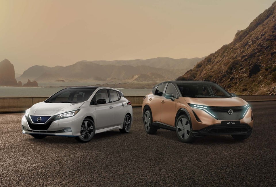
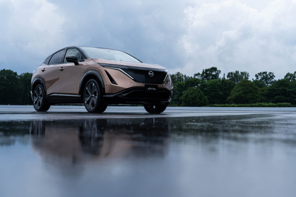
During Nissan’s 80+ years in business, the maker has emblazoned their cars and their advertising with more than a dozen different logos. Bouncing back and forth between a round logo and a rectangle, and once even giving freestanding script a try, the company has now decided on a fresh take on their logo, which will first grace the 2022 Ariya EV, an all-electric crossover.
The New Nissan Logo

So, why the update?
Make no mistake, logo changes are not taken lightly, and there is usually a specific reason or goal for making such a big change to the company’s branding. In this case, executives wanted a logo that would work better on digital platforms and look good when illuminated.
The current Nissan logo features more of a 3-D look, while the new Nissan logo is flatter and devoid of the shadowing on the current logo.
While the new logo won’t make its official debut on a vehicle until late 2021—that’s when the 2022 Ariya EV will hit the lots—talk of the update has circulated since early this year. That’s when eagle-eyed industry watchers noticed that Nissan had filed for trademarks for new logos, and it’s when all the chatter and speculation began in earnest about what the new look may entail.
The mystery ended when Nissan released a rather dramatic video to introduce the new logo to the world. In the 1:02 long video, which can be found on YouTube, various features in nature grow and morph in a time-release-camera-shot style. As crystals, flowers, frost, and fields grow and change, they ultimately take turns transforming into the new Nissan logo which is, perhaps, a nod to the thought that Nissan is changing but, like nature, is still beautiful and powerful.
The video is compelling, well-done and, as mentioned above, dramatic. For all the drama of the video the changes to the logo are much more subtle, yet still result in a fresh new look that accomplishes the goals of the company.
Rather than the enclosed ring in the old logo and a rectangle with text crossing through, the update is still a circle, yet it is broken where the text cuts through. The text and circle do not touch, resulting in a sleek, clean look that is modern yet still recognizable.
The goal of designing a logo that would be attractive when illuminated and that would work well on digital platforms has been accomplished while still retaining enough of the old design so as to not lose all nostalgia.
The logo for Nissan’s performance division, Nismo, also got a logo makeover, and it now also features a flatter, 2-D design.
While both logos have yet to be introduced on a vehicle, they are already being used in branding and have replaced the old logos on the Nissan website.
With the new logo being rolled out, now is a fun time to examine all the many incarnations the logo has taken during the maker’s 80 years in business. Take a look and let us know which one was your favorite. You can also stop by Patterson Nissan to see our current in-stock inventory of new and used Nissan cars and trucks.
During Nissan’s 80+ years in business, the maker has emblazoned their cars…
Options are more limited than ever when searching for luxury body-on-frame style…
The 2021 Nissan Rogue is all-new and features some big changes from…
If you’re in the market for a truck, then there’s a good…
The all-new 2023 Nissan Ariya enters the electric SUV market with an abstract design,…
Mid-size truck buyers have a lot of options, based on brand loyalty,…
For more than 30 years, Rocky Ridge has been a leader in…
Self-driving cars once sounded like something right out of the imagination of…
